When the time comes to overhaul your website, it’s important to consider what you want out of it. If you want to generate and nurture new business leads, increase the visibility and strength of your brand, or enhance growth and profitability, you’ll likely want to build a lead generation website. But these sites aren’t inexpensive. They typically cost 20-50% more than a traditional “brochure-ware” website—due in part to the specialized features and functionality they require. But the revenues they create can quickly cover the investment costs.
Can you retrofit your existing site with lead-generating features? Maybe, though you have to pay special attention to the way the new elements affect your user experience and design. Many firms are better off building a new website from scratch. In this post, we’re going to examine two key features of these sites and explore the interplay of design and functionality.
1. Content
 Feature: Content is an essential part of a lead generation website. Now, I’m not talking about descriptions of your firm, people, and services. (Those are important, but for different reasons.) Instead, I’m referring to a wealth of educational content you will develop and give away for free on your website. You’ll want to create content that will be useful to your target audience. Select a few issues—ones that your clients really care about and reflect your expertise—then start writing on a range of topics that relate to those issues. The easiest place to produce this content is on a blog. Later, you may want to develop other types of content, such as white papers, executive guides, research reports, infographics, SlideShares, and ebooks. Over time, you will create content that addresses every stage of a prospect’s buying journey.
Design: Once you have a variety of types of content, you’re going to need to a place for it on your website. This section should be called something intuitive such as Insights, Library, or Resources. Whatever you call it, reserve this section exclusively for educational content — don’t dilute it with company news, events, or other self-promotional materials. This should be an impartial preserve of learning. The design of these pages should allow you to prominently feature specific features, not unlike the end caps on a grocery store aisle. And if you have a lot of content, be sure to provide a convenient filtering mechanism that makes it easy for people to find what they are looking for.
2. Offers
Feature: An offer is simply an element on a lead generation website where people can engage with your firm. There are two kinds of offers, hard offers and soft offers. A hard offer is one that leads to direct contact with a person at your firm. These might take the form of a request for proposal, a live demo, or a free one-hour consultation. A visitor would click on the offer, fill out a web form, and then convert. A soft offer allows people to take a smaller, incremental step in the sales process. It might include things like downloading a piece of content, subscribing to a newsletter, or signing up for a webinar. It’s for those who want to continue engaging but are not yet ready to talk with someone. Again, the user fills out a form and converts. It’s important to align your offers with your content. If someone is reading a blog post on understanding metadata, for example, you could provide an offer on that page to download a white paper that describes metadata best practices.
Design: Offers shouldn’t take up a lot of space on a webpage but they should be designed to be prominent and eye-catching—without detracting from the content on the page. The best offers incorporate compelling text, a visual, and a clear call to action (usually a prominent button). Writing and designing these offers is an art form. The words and pictures you choose can have dramatic implications on an offer’s performance. For critical offers, you may even want to test different options to find the optimal configuration. Offers can appear throughout your site — on the homepage, in the sidebar of subpages, and even within a page’s content. Another thing to keep in mind, when you send someone to a landing page to fill out a web form or download a piece of content, you want to make sure it’s easy to read, with a nicely designed and easy-to-understand form. And make sure that the offer is the only thing on a landing page. You run the risk of losing the conversion if there are too many distracting elements on a single page.
While there are many other components that go into a lead generation website, you want to always keep in mind your users’ experience. While it’s easy to get wrapped up in the latest technology or website features, it’s critical that form follows function. Make the site easy for a visitor to navigate, with easy-to-read fonts, and ample white space throughout the site. After all, if the user isn’t having a good experience on your site, it’s going to be difficult to turn them into a new lead.
Additional Resources:
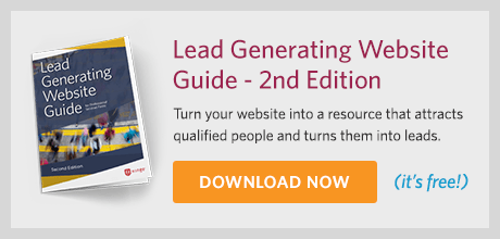
- Check out our Lead Generating Website Guide to learn how your firm can generate qualified leads with its website.
- Ensure that your website and content gets found online with Hinge’s SEO Guide for Professional Services.
- Hinge University offers a wealth of step-by-step instructions to make your website more effective.
How Hinge Can Help:
Your B2B website can be one of your firm’s greatest marketing assets. Our High Performance Website Program helps firms like yours drive online engagement and leads through valuable content. Hinge can create the right website strategy and design to take your firm to the next level.