Even as great many AEC firms embrace online marketing, more are neglecting an important component of their presence on the web. The sad truth is that even the best online marketing efforts can fall flat if your firm’s site isn’t responsive to the variety of devices your audience is using. Neither your site nor the content it houses will live up to its potential if it’s difficult to view or slow to load. That’s where responsive design comes in.
What is Responsive Design?
Think about the sites you visit on multiple devices—maybe a news sight that you browse on your laptop first thing in the morning, and then later peek at on your phone over lunch. Equivalent content is available through both platforms, but it’s arranged differently in each of the browsers. That’s responsive design—an approach to website design that allows dynamic changes depending on screen size, as well as the orientation of the device.
Responsive design is built on breakpoints. These are essentially measurements that determine the layout your site will use on a device. If a browser’s width is above a certain measurement or breakpoint, it will load a layout tailored to that width. If the width is below that point, a different layout will load on the screen—one easier to view in a smaller browser.
The beauty of responsive web design is that it doesn’t require you to generate separate code for all possible devices. Each device receives the same code, but CSS (cascading style sheets) is used to determine the appearance of the pages within the various browsers. Elements on the page reshuffle to fit the appropriate browser. For example, content that’s presented in three columns on your desktop might be two columns on your tablet or a single column on your phone.
See the two screenshots below of Freeman White's homepage. The first is on a desktop browser and the second is on an iPhone. Freeman White does a great job of simplifying their homepage to be suitable for a mobile version, still including the most important elements.
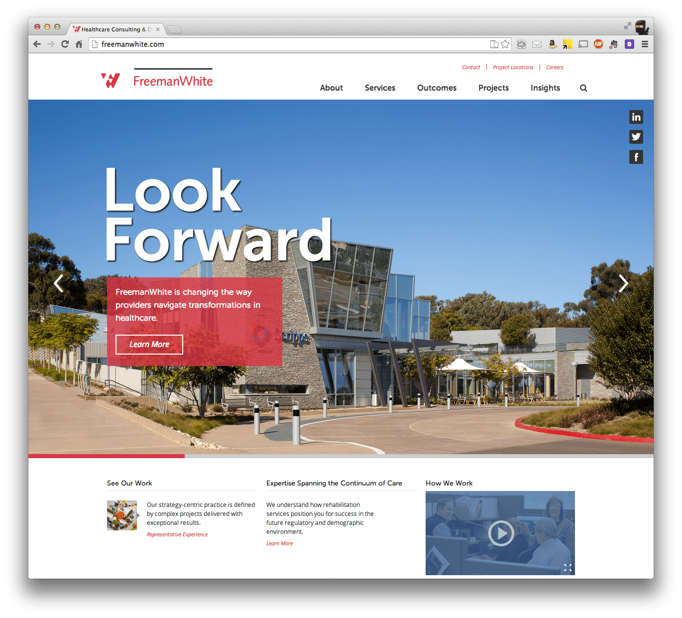
(Desktop version)
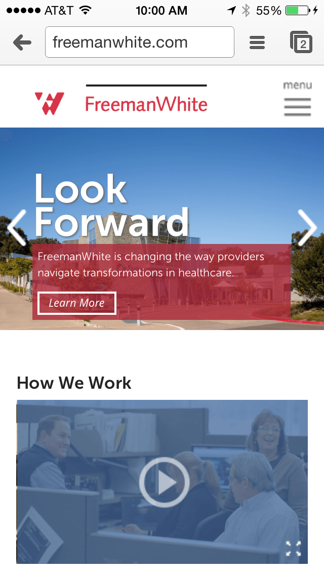
(iPhone version)
User Experience
To keep your visitors engaged, make sure they have a positive user experience. Here are a few things to keep in mind as you consider user experience through responsive web design:
Layout
- Make sure the elements of your design are reorganized to fit skinnier or longer pages
- Your design must be usable at all screen resolutions and sizes
- Test your site across several platforms to ensure that design elements create a good user experience on both desktop and mobile devices
Prioritizing Content
- Much more content is visible on a desktop than a mobile device, so make sure your most valuable content is available and highly visible on the smaller screens of mobile devices. The last thing you want is for users to become frustrated as they scroll endlessly for content on smaller screens. If you have a unique or new service to offer, lead with it—or at the very least make it quick and easy to access across all devices.
Performance
- Keep in mind that because responsive design delivers the same code to both desktop and mobile devices, slower connections can create lag time in content delivery.
- Test user experience. Take it to the streets; get out of your usual wifi hotspots and areas with solid cell reception. Try some older devices and browsers. Obviously not all user experiences can be identical, but it’s in your best interest to mitigate potential bad ones.
- Because identical experiences aren’t possible, do everything you can to make them equivalent. Equivalent content, equivalent interactivity… it’s the best way to ensure your customer trusts your content and your capabilities.
In AEC, your website is often the first—sometimes the only—contact a potential client will have with your firm. No matter your other expertise and competencies, the layout presented, its ease of use, and the availability of your site will reflect on your firm—hopefully for the better.
Ready to move your firm into high growth? Consider reinvesting in your website, and watch what happens. Download the Lead Generation Website Guide for more information.
On Twitter or LinkedIn? Follow us @hingemarketing and join us on LinkedIn.
